
 This post provides a review of a recent case, T-398/16 -Starbucks Corp v EUIPO and Hasmik Nersesyan.
Key points
• The threshold for similarity is low
Here, the General Court (GC) of the EU ruled in favour of Starbucks, which argued that a “coffee rocks” logo for another coffee shop was too similar to its own.
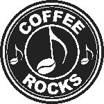
EU011881943
The trade mark application at issue (EU011881943) was filed by Ms Nersesyan in 2013 for a circular, black-and-white design featuring the words “coffee rocks” in relation to “services for providing drinks” in class 43. The application was published in November 2013, and Starbucks filed a notice of opposition in February 2014.
In 2015, the EUIPO Opposition Division rejected the opposition in its entirety. The appeal was then dismissed in 2016 by the Fourth Board of Appeal, which found that the marks were visually, phonetically and conceptually dissimilar because they only had descriptive or non-distinctive elements in common, namely the word COFFEE, the black circular device with white elements and the font used. As the distinctive features were found to be dissimilar, the Board of Appeal (BoA) did not conduct any assessment into likelihood of confusion between the marks.
GC determination
In January 2018, the GC sided with Starbucks, noting that a global assessment of the likelihood of confusion must be carried out if there are some similarities between the marks, because the average consumer normally perceives the mark as a whole and does not engage in an analysis of its various visual, phonetic and conceptual details. For example, it could not be ruled out that the relevant public would associate the marks with the concept of a coffee house. Therefore, even though the dominant components STARBUCKS and COFFEE ROCKS are different, the other elements of the marks are not negligible when considering the overall impression.
The GC stressed that a global assessment with regards to likelihood of confusion involves interdependence of the similarity of the trade marks and the goods or services. Therefore, a low degree of similarity between goods or services may be offset by a high degree of similarity between the marks, and vice versa.
In this case, the GC stated that there were “three sets of visual similarities between the signs at issue”. Namely, the same general appearance made up of: “circular devices consisting of two parts”; the “use of the same colours”; and the “use of the same font for the word elements”. Consequently, the GC ruled that the signs were partially identical with regard to one or more of their relevant aspects. It found that the BoA had erred in ruling out any similarity – even a low degree – between the marks, and was wrong not to carry out an overall assessment of the likelihood of confusion.
Confirmation
This case highlights the importance of conducting a global assessment when considering likelihood of confusion and confirms that the threshold for similarity is low, because minor adjustments to the figurative elements of a famous trade mark are sufficient to result in a finding of confusion or dilution.
Amelia Skelding 20 June 2018
This article was first published in the CITMA Review May 2018
